Megan Fantes
Published
May 26, 2026
Every machine learning model is a snapshot of yesterday. It learns the shape of the world from the data it was trained on, and then we ship it. From that moment, the world keeps changing. The model, and the data scientists, have to keep up.
We have a name for what happens next: drift. Internally, we like an even simpler definition — time passes, and things change. A partner adds a checkbox to a form. A new data source comes online, and the inputs get a little richer overnight. All of it leaves fingerprints on the model’s outputs.
This post is about how we listen for that drift on SentiLink’s fraud models, what the listening looks like in practice, and three real examples from the past year of what we’ve heard.
The most boring possible example of drift
Before any of the fraud stuff, here’s the simplest case we have. One of the features in our models is the age of a record in the Manifest, our internal database of identity history. The oldest records date from when we started collecting data. Every year, by definition, those records get one year older.
The whole population shifts one bucket to the right, exactly as the calendar would predict, right on time.
This is drift in its purest, most innocuous form, and it makes the first point cleanly: drift is not always bad. It’s just change. Our job is to figure out which changes are a problem, which are a signal, and which are a yawn.
Two flavors: feature drift and score drift
Changes show up in one of two places.
The inputs can change. Maybe a partner starts collecting an email field they didn’t previously collect, or our coverage on a particular data source suddenly improves. We call this feature drift.
The outputs can change. The distribution of scores we calculate moves — more mid-range scores, fewer high ones, a thinning of one tail. This is score drift, and it’s often a downstream consequence of feature drift, though not always.
We watch both every week. The summary statistics we use are called Stability Indices (Population Stability Index, or PSI, for score drift, and Characteristic Stability Index, or CSI, for feature drift). Simply put, these are single numbers that add up when two distributions diverge. Below 0.1 we call green. Between 0.1 and 0.2 is yellow — a polite cough from the data. Above 0.2 is red.
A weekly report rolls in. Most of the time, nothing’s there. Sometimes there’s a story.
Story 1: a required field changed everything
Last June, our drift report flagged a model we run for a partner. PSI had been quiet for months, and then it wasn’t.
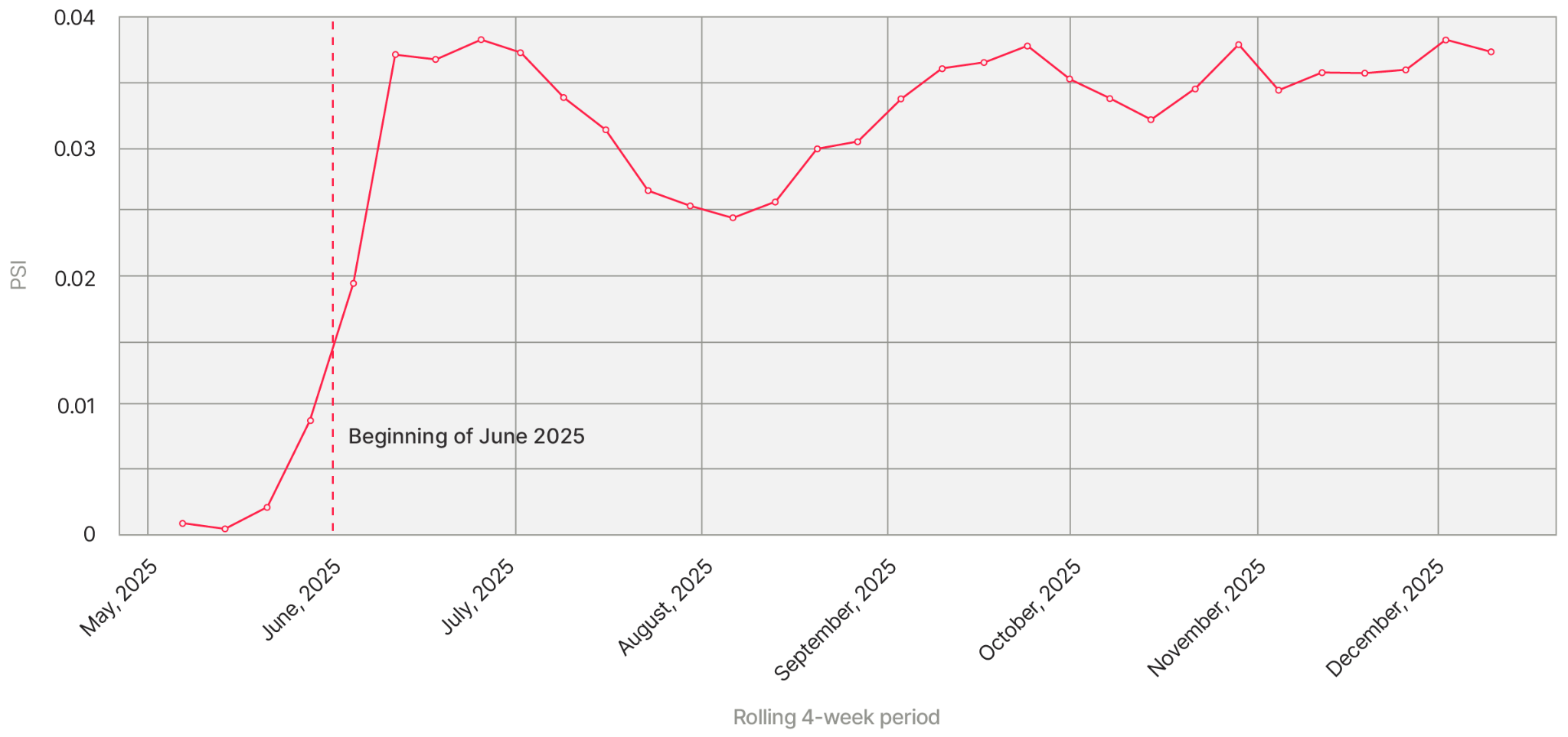
We had to worry if the model was getting worse, and if so, worse how?
We looked at the score histogram.
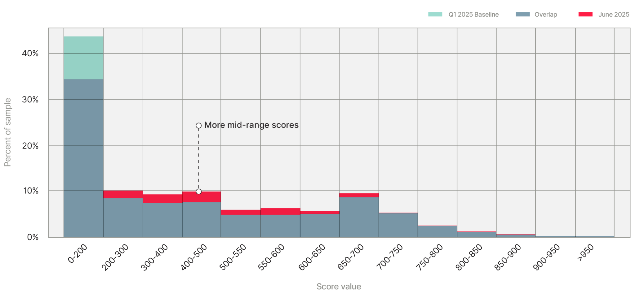
The very-high and very-low scores held mostly steady. The middle of the distribution — roughly 200 through 700 — got noticeably fatter. The model was producing more “there’s some kind of signal here” answers than before. So we walked through the inputs, looking for a feature whose change matched the change in the outputs. We found it on the first try.
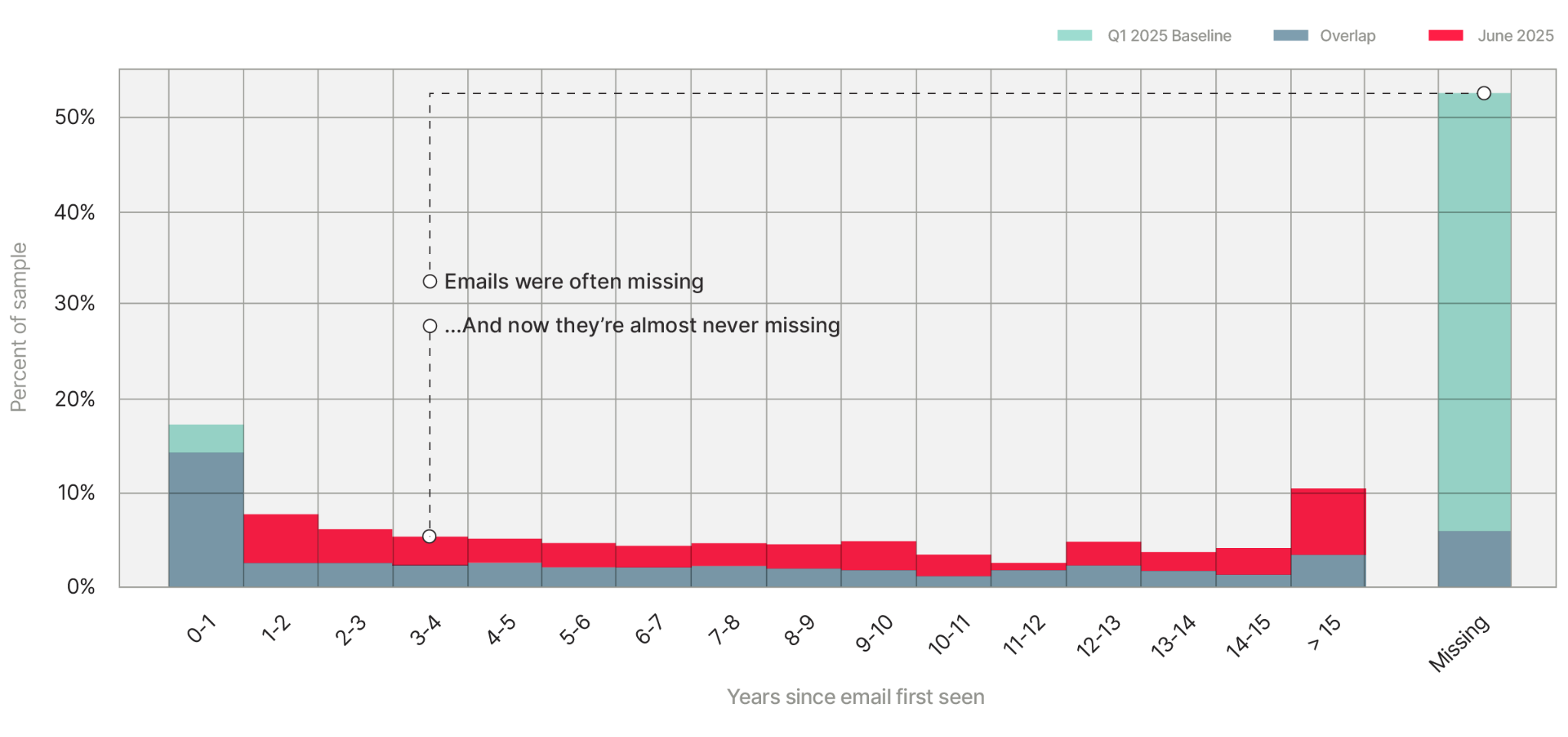
The big blue bar on the right of the chart is what email history used to look like for this partner: more than half of applications came in without an email address. By June, that bar had nearly disappeared. The partner had quietly made a change to their application form.
A feature that used to be missing most of the time was now populated almost every time. From the model's perspective, that's a meaningful change in the world: an email address carries all kinds of signals that the model didn’t have access to before the model had learned how to confidently score applications without seeing an email address, and now it was more hesitant, because it was being handed information it had less practice digesting.
We talked to the partner. Other performance metrics — actual fraud caught, false positive rates — were still fine. The model wasn't broken, it was just being compared against a baseline that no longer existed. So we didn't replace or redesign anything, we reset the baseline. June 2025 is the new normal. From then on, when we asked "is anything drifting?", we asked it relative to the post-June world.
The takeaway: not every twitch on a drift chart is a model going bad. Sometimes it's the world becoming more informative than it was before.
Story 2: a bot attack, visible only in the histograms
Three months later, a different partner lit up the same monitor. This one looked different from the start.
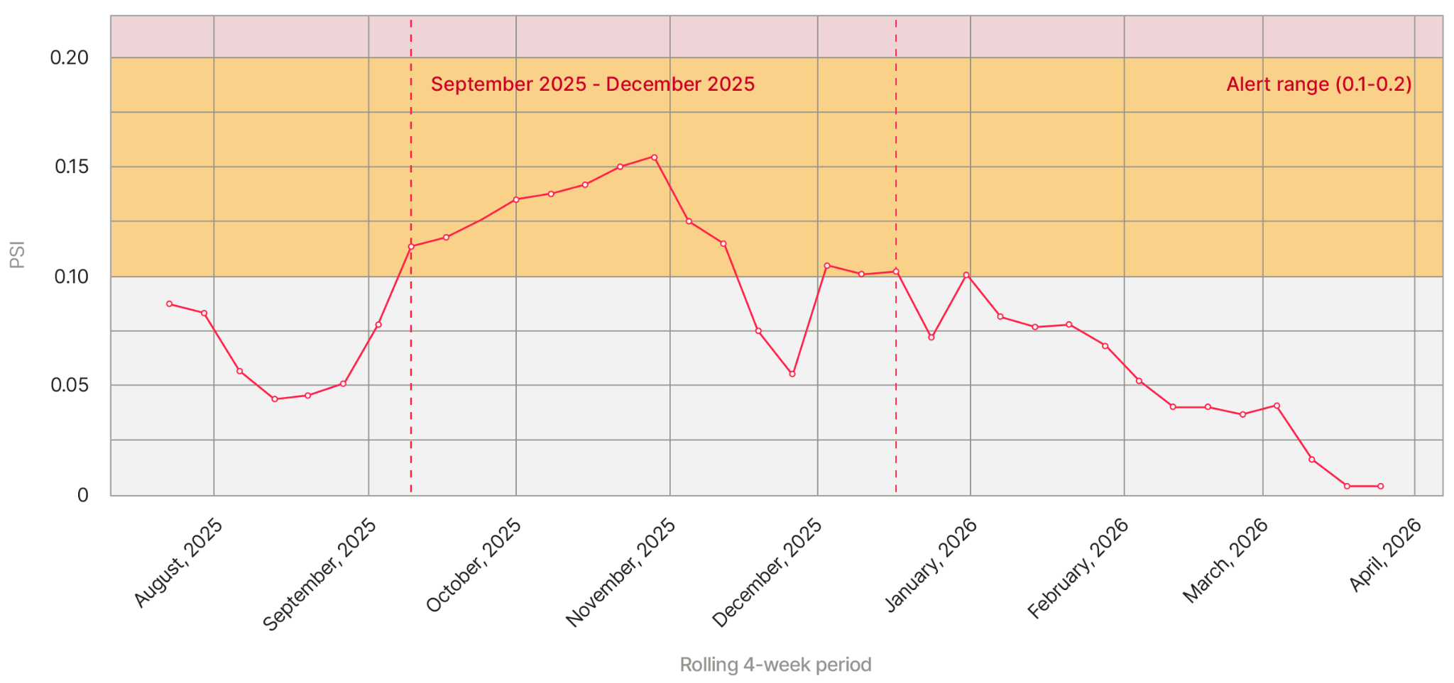
Yellow zone, persistent. We pulled up the score distribution.
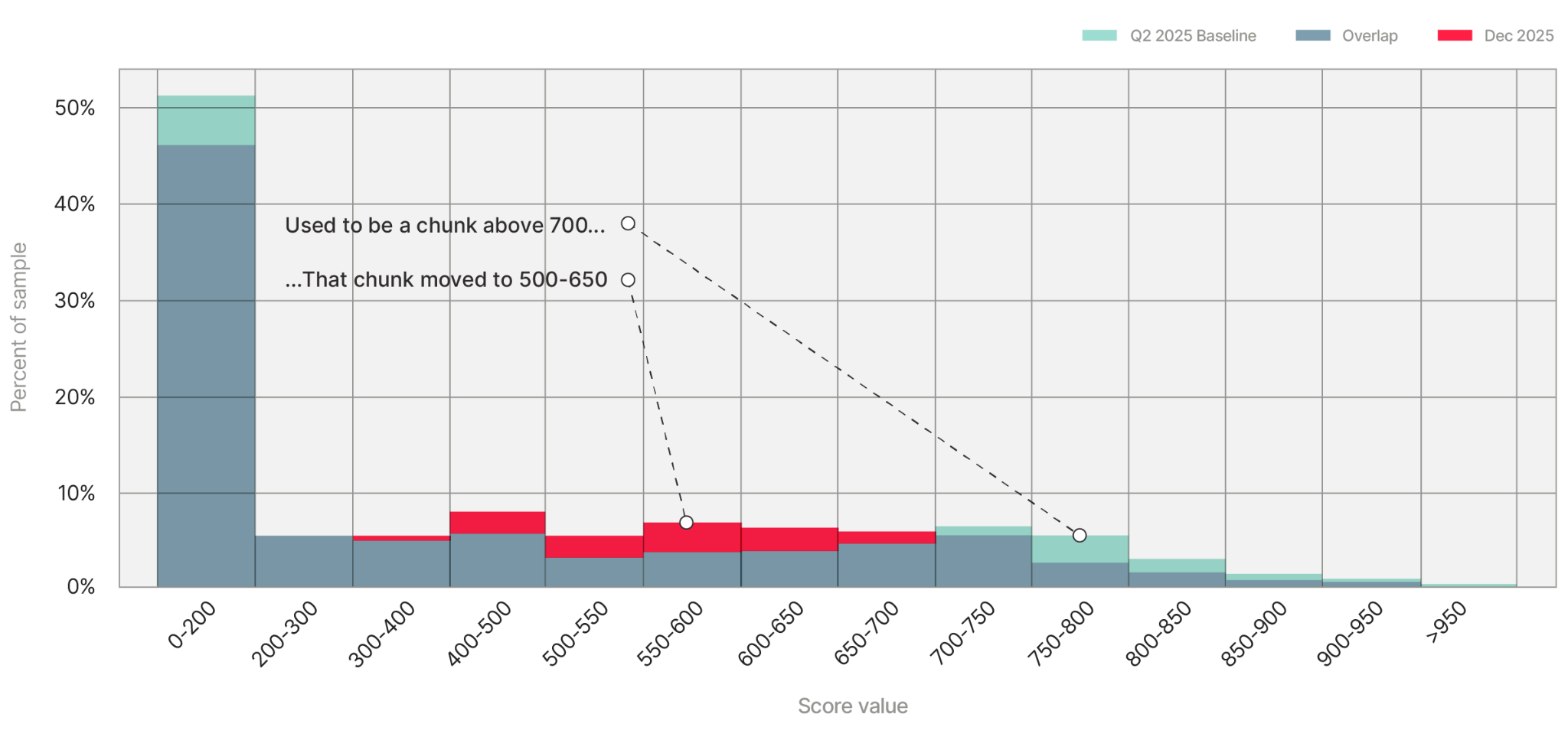
Look at the blue then vs. the red now, where the blue used to be. There was a meaningful chunk of applications scoring above 700 — high risk, by our scoring convention. In October, that chunk evaporated and reappeared around 500–600. Our magic 8-ball had gone from “outlook suspicious” to “reply hazy, try again.”
Now we were paying attention. Into the features.
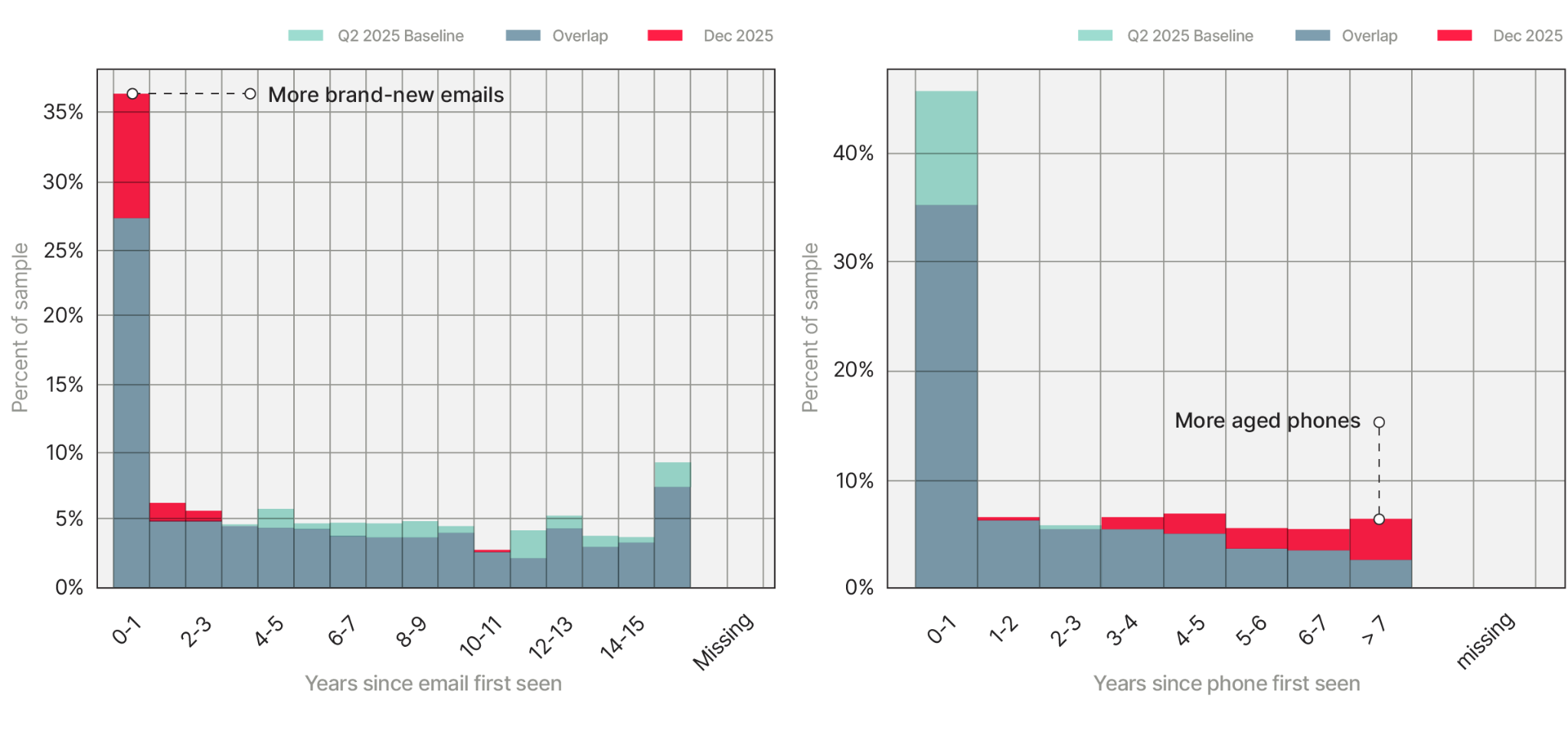
Two charts, two stories. The first chart tracks how old an email address is when it shows up in an application. We noticed a spike in the leftmost bucket, the partner was suddenly seeing lots of brand-new emails. The second chart tracks the same thing for phone numbers — and there we see a fat new spike on the right, they were seeing way more old phone numbers than unusual.
Brand-new emails plus aged phones, arriving together at unusual rates, is a textbook signature of a bot attack. Fresh emails are easy to spin up at scale; aged phone numbers get bought off lists. The combination is a tell.
The attack was clever. People don’t change their phone numbers much, so an old phone number usually means a real person living a real life. One application with an aged phone and a fresh email just looks like someone who got a new Gmail. Thousands of them, arriving all at once, looks like something else entirely — and that’s exactly what the shape of the histograms told us.
Story 3: we got better, and the old model couldn't tell
Here’s a happier story. Over six months, one of our models started drifting for the best possible reason — we knew more than we used to.
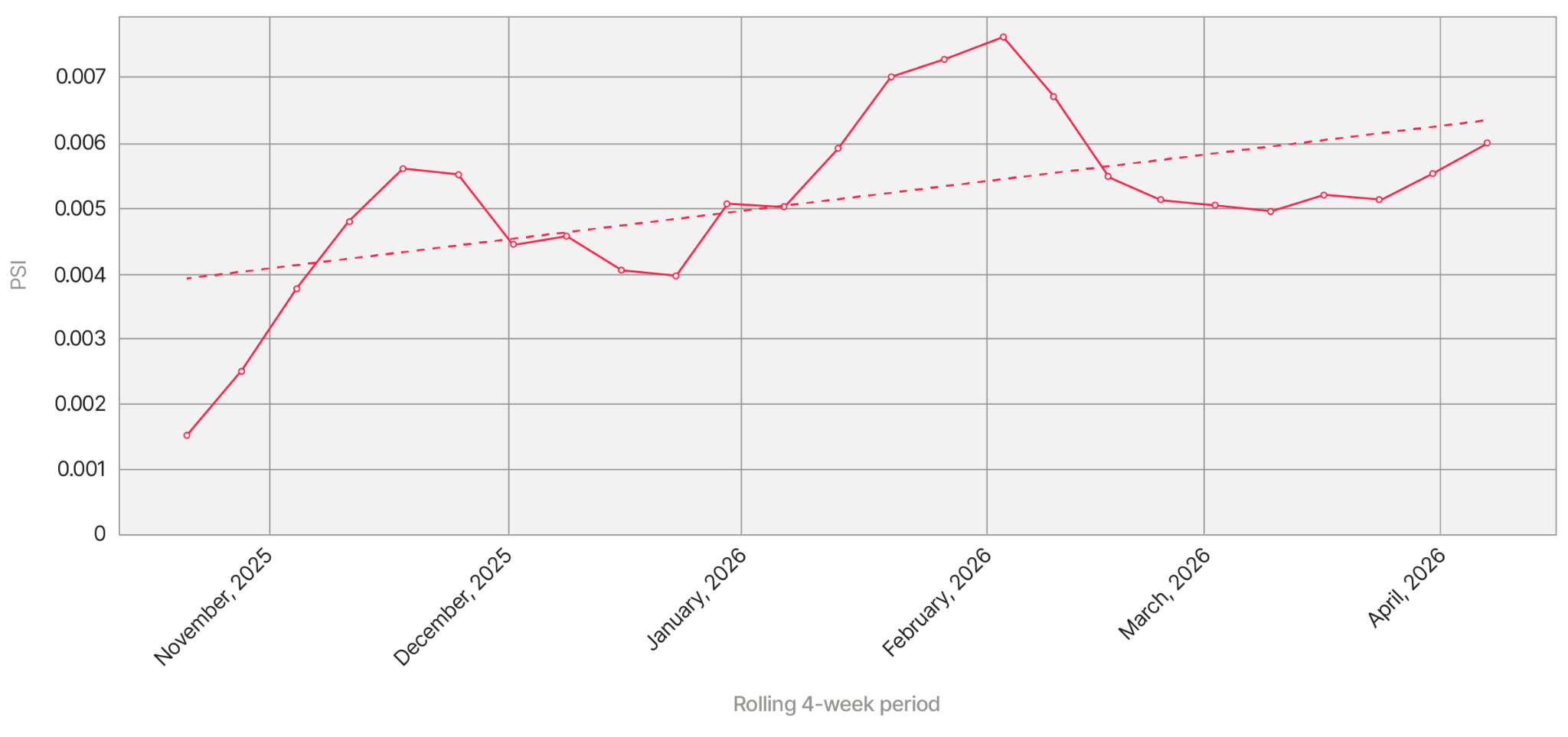
The numbers here are small – a sliver of the PSI scores we saw with the bot attack – but they continued to slowly climb, month after month. Something was changing. But what?
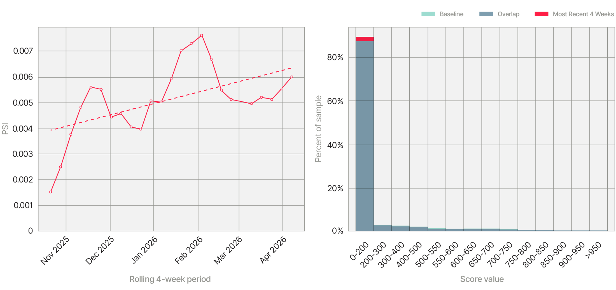
New data sources had come online. In sports, a tough call sometimes becomes clear from a new camera angle. The new data worked the same way — helping us disambiguate a segment of previously murky applications and move them solidly into the "not fraud" scores, below 200.
Why this matters
In a perfect world, we could learn what fraud looks like once, and then nothing changes and we can identify the same patterns forever and ever…but we don’t live in that world. We live in a world where fraud, people, companies, and data are always changing. As experts in fighting fraud, we have to adapt – and to adapt, we have to know how the world is shifting around our models. When we see the shift before our partners, we can reach out. We can ask questions and work with them to understand what has changed.
There's a version of fraud investigation that resembles detective work — a crime occurs, you examine the scene, and the clues you find in that one case teach you what to look for across millions of others. This is a quieter side of fraud investigation, using graphs as clues. One person with a brand-new email and an old phone number is just a person. Ten thousand applications arriving at the same partner in the same month makes a bar chart that sounds an alarm.
Subscribe
Share


Related Content


.png)